A Hurst Cycles
Analysis of the S&P 500
A
Hurst Cycles Analysis of the S&P 500 Index
A Hurst
Cycles Analysis of the S&P 500 Index is Part 3 of an
Introduction to J.M Hurst cycles analysis and Hurst trading
methods, by
Christopher Grafton, Author of "Mastering Hurst Cycle Analysis".
S&P 500 Index Hurst Trading
Cycles Analysis
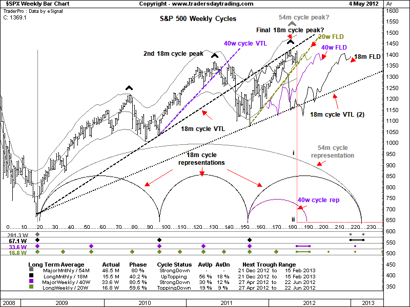
Figure 1 below shows a weekly Hurst trading cycles analysis of the
S&P
500 index from March 2009 to 3 May 2012. The various plotted lines and
labeling may look a bit confusing initially, but let’s walk through
what is being shown here.
Hurst's Cycle Phasing Analysis
The first thing to notice is the grid at the bottom of the chart with
the coloured diamonds and data. This is the output of Hurst’s
third trading tool, the cycle Phasing Analysis.
|
|
Hurst
Cycles Analysis
Contents Index
Related Pages
|
Cycles
build upon each other to form composites and it can be very difficult
to isolate individual cycles within the composite unless a phasing
analysis is carried out.
When a long cycle is trending, its shorter component cycles tend to be
swamped: their amplitudes are muted and they are therefore hard to pick
out.
Similarly, during fast sell offs, cycles tend to compress in length,
which again makes them difficult to identify.
In order to resolve the composite into its component parts, the
Hurst analyst phases the chart by picking out the cycle lows and
marking their time locations in the grid.
|
Kennys Technical Analysis

Kennys Elliott Wave Analysis is my trading plan for
the week ahead with regular updates.
Technical analysis reports using
Elliott waves, chart patterns, trend trading strategies, Hurst cycles
and other stock market
time cycles analysis.
Kennys
Elliott Wave Analysis |
The
time locations of longest cycle troughs (here the 54 month) are
marked in the top row; the next longest (18 month here) in the row
below and so on. Because of synchronicity, a long cycle
trough contains all of the troughs of the shorter cycles, which is
indicated by stacks of diamonds, for example at grid 20 to the left of
the chart.
The real purpose of phasing analysis is to calculate the period and
status of each cycle in the composite. Here we can see that the Long
Monthly cycle (the 18 month) has an actual period of 15.5 months; is
40.2% along its path and its status is therefore Up-Topping. We can
also work out the average percentage change of upswings (56%) and
downswings (18%). Finally, we can estimate when the next
trough is due: for the 18 month it is between 21 December 2012 and 15
February 2013. Take a moment to study the grid and the
diamond placements.
|
 Figure 1.
S&P500 Weekly Hurst Cycles Analysis (data Esignal, chart
software Updata)
S&P 500 Weekly Hurst Cycles Analysis
Results
A
Weekly Hurst Cycles Analysis of S&P 500 - Valid Trend Lines
(VTLs)
The
black VTL drawn between the last 54 month cycle low in March 2009
and the first 18 month cycle low in September 2010 (grid 95) shows the
broad direction of prices over the last 37 months. This VTL was broken
from above in August 2011 (grid 143) which means that the previous peak
could be that of the 54 month cycle: thus, the status of the cycle in
the lower grid is Strong Down. The problem with this
interpretation is that the most recent peak (5 April 2012) is higher
than the purported 54 month peak in April 2011.
While this is not impossible (think of an Elliott Wave expanded flat),
the more conservative approach is to plot the VTL from the origin
through the second 18 month cycle low – 18 month VTL (2). The
54 month cycle is comprised of three major components (the 18 month)
rather than the more usual two, which gives you two choices.
Here we will use the second VTL. If there is a downside cross
of this line by prices (somewhere between 1200 and 1300) then we know
for certain that the next longer cycle (the 54 month) has reversed –
this of course is very useful information and has important
implications for downside risk going forward. However, it
would also be a very late signal. So is there any way to get a head
start and call the top earlier?
One way would be to look at the status of the shorter component Hurst
cycles. A twenty week cycle VTL has been drawn towards the
end of the data (in olive) and this looks vulnerable to a breakdown –in
fact it has broken on the daily chart. If this VTL goes then
we know that the 40 week cycle peak is in place. Since an 18
month cycle consists of two 40 week cycles, this first peak could also
be that of the 18 month cycle. Alternatively, the 18 month
cycle peak could come higher and later.
We need some additional evidence to convince us that the upcoming 40
week cycle peak will not be exceeded and is therefore also the top of
not only the 18 month cycle, but also the long 54 month.
A Weekly Hurst Cycles Analysis of S&P 500
- Forward Line of Demarcation FLDs
If the current 18 month cycle advance still has upside power and we are
therefore likely to see a second higher 40 week cycle peak, then it
will show in an FLD upside projection. A black 18 month FLD
has been plotted and prices crossed up through it on 27 January (grid
170) at 1,315. Subtracting the 18 month cycle low on 7
October 2011 at 1,074.77 from the value of the FLD cross (1,315) gives
a difference 240.23 points.
Recalling the earlier example using offset ideal cycles, it should be
that the cycle will carry the same distance beyond the FLD cross, that
is to say up to 1555.23 (1,315 + 240.23). What happened
however was that the purported high at 1,422.38 on 5 April fell short
by 133 points. This undershoot is a clear
indication that trend (the sum of the longer cycles) is working against
the advance and that a top is likely in place. This
in turn suggests that the 20 week VTL cross will call not only the 40
week peak, but also the 18 month and therefore, since it is the third
and last in the series from 2009, the 54 month cycle peak.
For extra clarity the cycles are represented by semi-circles in the
lower part of the chart. The long grey one is the 54 month
cycle, the black one represents the 18 month cycles and the small
purple one the 40 week cycle. The vertical red line (i – ii)
at the last date (grid 180) gives a quick snapshot of what is happening
right now and supports the information provided in the grid,
namely: 54 month - Strong Down; 18 month - Up Topping and 40
week strong down.
Finally, let’s take a look at the FLDs arrayed off to the right of the
data. This arrangement of tightly clustered FLDs running in
parallel Hurst named a cascade. When we see this after a
steep advance, it is a warning that a sharp reversal is about to take
place.
Recall from the earlier description of ideal cycles in anti-phase that
when the first cycle crosses down through the second, we know that the
cycle has recently reversed. Note that the 20 week looks very
close to being crossed, which will add conviction to the 40 week cycle
peak call. In this case think of price action as the lead
cycle and the FLD as the second out of phase cycle. A
penetration also provides a downside projection.
At this stage we can only estimate where the intersection will take
place, but 1,380 looks about right. The recent high was
1,422, and so the difference is 42 points. Projecting this
value down from the FLD cross would bring prices to 1,338 – other
things being equal.
Turning our attention now to the lower 40 week FLD (purple) it looks
like a price cross would take place at around 1,350. Since
the 20 week FLD downside projection is 12 points lower, it means that
the 40 week FLD is also vulnerable to a cross. We can
therefore make another projection lower from here.
Taking the difference again between the FLD cross (1,350) and the high
(1,422) gives 72 and subtracting this value from the intersection
projects down to 1,278.
We can do the same again here with the 18 month FLD (black, lowest). If
this is crossed at 1,278 then we have a final projection down to 1,134,
which puts prices back into the August to October 2011 base area.
A Weekly Hurst Cycles Analysis of S&P 500
- Summary
This has been a whirlwind tour of Hurst’s main concepts and a brief
analysis of the S&P 500. I hope it has been
useful. Hurst trading cycles analysis seems complicated at first, but
once
you get the hang of it, you will start to see the benefits.
An adept Hurst cycles analyst is able to draw the curtain back on the
market,
so to speak, and look at the inner workings with more
clarity. Having a clear view of what is actually going on
rather than guessing or relying on tired, more traditional tools will
help you manage risk more effectively and trade with more conviction.
Chris
Grafton, Mastering
Hurst Cycle Analysis
|
John Murphy Video (90 Min)
Let John Murphy guide you through his thought process in selecting
markets to trade, in this Free 90 min video. This classic video is
still one of the most insightful you are ever going to see on investing
and trading.
Among Other
Free Videos Available
- Using
Pattern Probability to Trade with the Trend: Curtis Arnold
- Market
Wizard Insights: Jack Schwager
- Options
- Learn The Greeks: Ron Ianieri
Watch
John Murphys "Applying Technical Methods to Today's Trading" for Free. |
Mastering Hurst Cycle Analysis
 A
modern treatment of JM Hurst's
original
system of financial market analysis A
modern treatment of JM Hurst's
original
system of financial market analysis
by Christopher Grafton
Pages: 384
Published: 30 Nov 2011
|
Free
Guide
Elliott Wave
PDF
Free to
download, the Traders
Day Trading free Elliott
Wave Theory PDF quick start guide. Download it free now
for a quick
overview of the basics.
It is a handy reference guide to the
basics of the wave patterns and wave formation.
|
Search Traders Day Trading
|
Stock Market
Trading Basics
|
Technical
Analysis Guide
|
Learning About
The Stock Market
|
|