Understanding
Point and Figure Charting
By Jeremy du Plessis CMT FSTA
Point and Figure Charting Explained
Point and
Figure charting methods are different from any other type
of chart used in
stock chart analysis. The main reason being that
they do not
have a time scale. The chart does not advance as time passes
but rather as intermediate trends change.
Their foundations were laid in the late 19th and early 20th century
where traders needed an easy way of recording price
movements. Initially they did this by writing down the prices
traded throughout the day in columns; a rising column of numbers to
denote rising prices and a falling column of numbers to denote falling
prices. After awhile they began to notice patterns in their
price records and so what started off as a price recording system
became a stock analysis charting method known as a Figure chart.
|
|
Point and Figure Charting
Contents Index
Related Pages
|
Point and Figure charting Methods
As writing down prices became tedious, the numbers were replaced by Xs
and the chart came to be known as a ‘Point chart’.
Figure charts and Point charts continued to be used together and
chartists referred to their ‘Point’ charts and their ‘Figure’ charts,
or their ‘Point and Figure’ charts, the name we use today.
Figure charts eventually ceased to be used in the 1930s and in the late
1940s a new plotting method was developed using Xs for the rising
columns and O’s for falling columns.
|
Kennys Technical Analysis
 Kennys Elliott Wave Analysis is my trading plan for
the week ahead with regular updates.
Technical analysis charts and report using
Elliott waves, chart patterns, trend trading strategies, Hurst cycles
and other stock market
time cycles analysis.
Kennys
Elliott Wave Analysis |
Understanding Point and Figure Charts: Basics
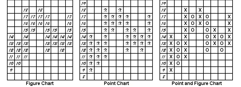
Figure 1 shows the development of the P&F charting methods.
 Figure 1:
The development of Point and Figure Charting
As you can see, Point and Figure charts assign a value to each
square
on the chart, which P&F chartists call ‘boxes’.
In the example above, each square or box is worth 1 point. As the price
rises or falls by 1 point or more, new squares are filled. Any price
change less than 1 point is therefore ignored. The value
assigned to the box, called the ‘box size’, depends on the price of the
instrument and how sensitive you want the stock chart to be.
For
example, you may use a box size of 100 for the Dow, but a box size of
.01 for the Euro. Reducing the box size, increases the
sensitivity of the chart analysis and therefore reduces the time
horizon.
As you can see from the Figure chart above, when the price changes
direction you have to move to the next column to write down
the numbers in the opposite direction. If, however, the price reverses
by only one box, sometimes a change of column is not required because
there may be space to write the number in the current column.
This became known as a 1-box reversal chart and is the original
plotting method. 1-Box reversal charts can therefore have an
X and O in the same column.
1-box and 3-box Reversal Charts
As 1-box reversal charts were quite sensitive, a more condensed
version, called a 3-box reversal chart, was also used. With
these charting methods, the price must reverse by at least the value of
three
boxes before changing columns and can therefore never have an X and O
in the same column. 3-Box reversal is now the most popular
Point and Figure method used today.
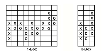
 Figure 2:
1-box and 3-box P&F Charts
Figure 2 shows a 1-box and 3-box construction using the same data
set. Notice the X and O in the same column in the 1-box
chart. Notice too how much more sensitive the 1-box chart is.
It is customary, when drawing Point and Figure charts, to name them
according the box size and the reversal. So a chart drawn
using
the 3-box reversal method where the box size is 5, is called a 5 x 3
Point and Figure chart; one where the box size is 20 using the 1-box
method is called a 20 x 1.
Remember that Point and Figure
charts came from the trading floors and bucket shops where every trade
was recorded. This was not a problem for anyone updating a
small
set of charts by hand each day, but impossible for anyone who wanted to
create a new long history stock chart. So some users
started using
end-of-day prices to draw their Point and Figure charts.
Two
charting methods were used, either the closing price at the end of the
day or,
the high
or low, at the end of the day. The end-of-day high and low cannot be
used because it is impossible, without reference to the intraday ticks,
to know which came first during the day. So a set of rules
was
devised to determine whether end-of-day high or end-of-day low are used
each day.
|
John Murphy Video (90 Min)
Let John Murphy guide you through his thought process in selecting
markets to trade, in this Free 90 min video. This classic video is
still one of the most insightful you are ever going to see on investing
and trading.
Among Other
Free Videos Available
- Using
Pattern Probability to Trade with the Trend: Curtis Arnold
- Market
Wizard Insights: Jack Schwager
- Options
- Learn The Greeks: Ron Ianieri
Watch
John Murphys "Applying Technical Methods to Today's Trading" for Free. |
The Definitive Guide to Point and Figure
by Jeremy du Plessis
|
Free
Guide
Elliott Wave
PDF
Free to
download, the Traders
Day Trading free Elliott
Wave Theory PDF quick start guide. Download it free now
for a quick
overview of the basics.
It is a handy reference guide to the
basics of the wave patterns and wave formation.
|
Search Traders Day Trading
|
Stock Market
Trading Basics
|
Technical
Analysis Guide
|
Learning About
The Stock Market
|
|